Umpqua Bank
Economic Trends
Landing Page
Timeline
January 2022
My Role
Senior Designer
Tools
Adobe CC & Optimizely (CMS)
Overview
Umpqua Bank is a regional financial institution based in the Pacific Northwest, offering personal and business banking with a strong emphasis on community engagement and financial education.
The goal of this project was to design and launch a digital landing page to promote the bank’s annual Economic Trends report. As the design lead, I was responsible for creating a polished, user-centered experience that aligned with content strategy, supported business objectives, and met the tight turnaround required for the campaign launch.
Problem
We had just three weeks to design, build, and launch the Economic Trends landing page, compared to several months in previous years. At the same time, an ongoing merger reduced internal capacity and left little room for iteration. The content came from a dense, print-focused report, and there was no access to new research to inform design decisions. The combination of a compressed timeline, organizational constraints, and limited resources shaped every part of the process.
My Role
I was the lead designer on the project, responsible for defining the layout, structure, and user experience of the Economic Trends landing page. I worked closely with our UX writer, Web Coordinator, and marketing stakeholders to transform a long-form, print-based report into a streamlined digital experience.
The primary audience included high-level business leaders and C-suite executives with limited time, so it was essential to design a layout that emphasized key takeaways and supported fast, intuitive scanning. I focused on making the content mobile-friendly, easy to navigate, and aligned with Umpqua’s brand and campaign goals.
Solutions
To move quickly without sacrificing clarity, we focused on structure, collaboration, and reusability. I worked closely with the UX writer to align content hierarchy with key business messages, and with the Web Coordinator to ensure the layout supported both mobile usability and CMS constraints.
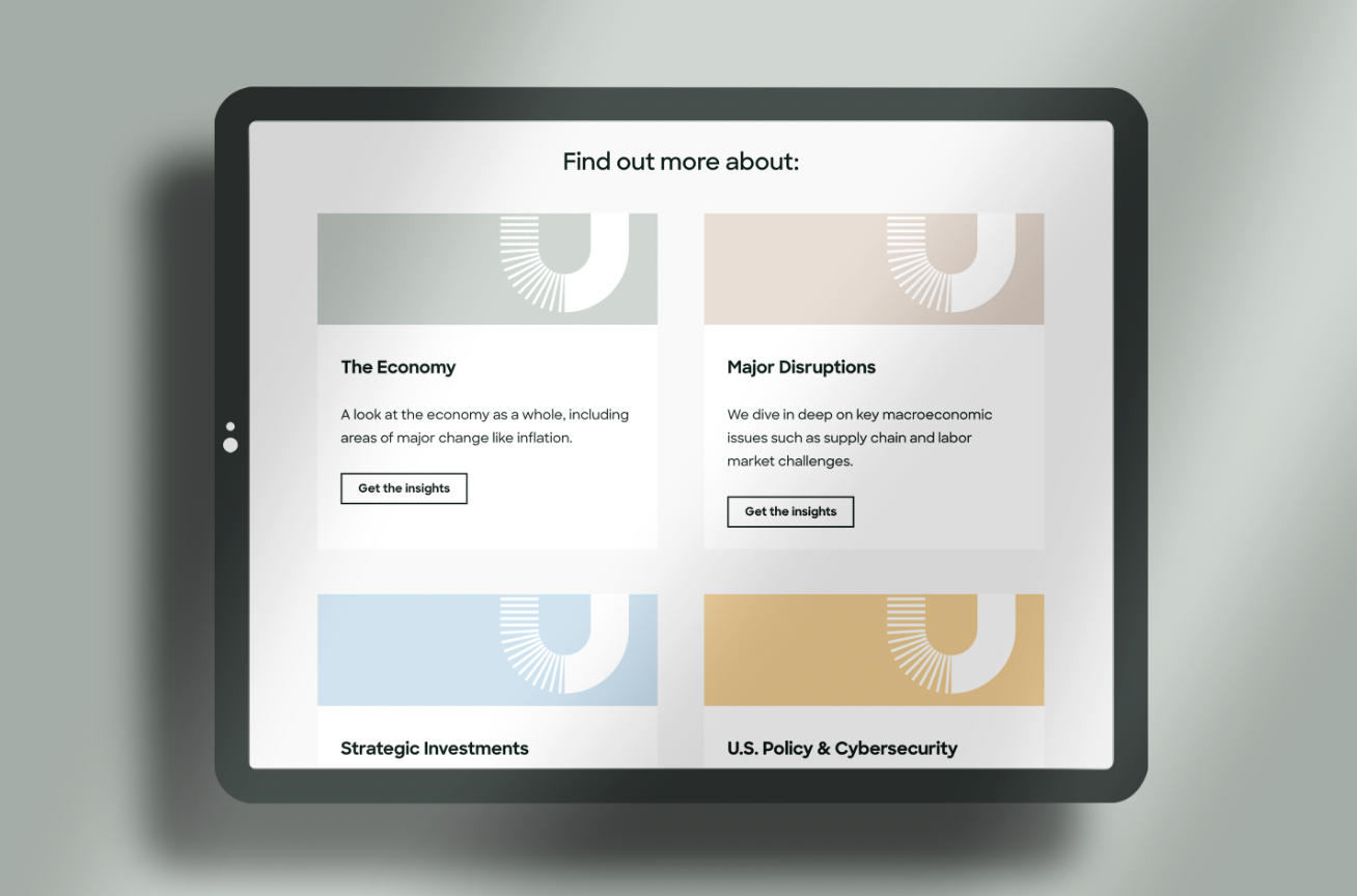
Each section was designed for fast comprehension, using clear headlines, condensed copy, and repeated calls to action to guide the user. The layout centered around a set of modular content blocks that allowed for flexible assembly and easy updates. By referencing patterns from past high-performing campaigns, we were able to make confident decisions without formal research or testing.
Outcomes
The landing page launched on time and successfully supported the campaign despite the tight timeline and limited resources. The final design made complex content more approachable and aligned with Umpqua’s brand and business goals.
Delivered a clear, mobile-friendly experience in under three weeks
Increased visibility and engagement with the annual Economic Trends report
Supported real-time edits and approvals through close coordination with internal teams
Provided a flexible layout structure that could be reused for future reports and campaign content
Opportunity
With more time and user insights, I would have refined the content structure to better meet audience needs. This could have included lightweight testing on layout variations, refining content hierarchy for better scannability, and improving internal linking to related resources. I also saw potential to strengthen mobile interactions and enhance accessibility through more targeted QA.
Questions?
Let’s connect. I’d be happy to walk you through my process or share more project details. Reach out if you’d like a full presentation.


