Client X
Design System Audit and Cross-Platform Alignment
Timeline
Aug 2025 - Dec 2025
My Role
Senior UX Designer
Tools
Figma and Zeroheight
Overview
Client X is an enterprise organization with marketing, brand, and product teams working independently on separate design systems for the same brand. Years of acquisitions carried forward different visual styles across the organization, often preserving fragments of previous brands. This resulted in noticeable inconsistencies across platforms, including variations in color, spacing, and overall presentation.
The Problem
As the organization grew and new brands were introduced, each team continued to evolve its design system based on its own needs. While these systems happened in parallel, the systems developed different components, styles, and foundational elements over time. This created visual inconsistencies across platforms and made it difficult to maintain a unified brand experience. Without shared standards to guide decisions, teams worked independently and sometimes duplicated effort.
Research
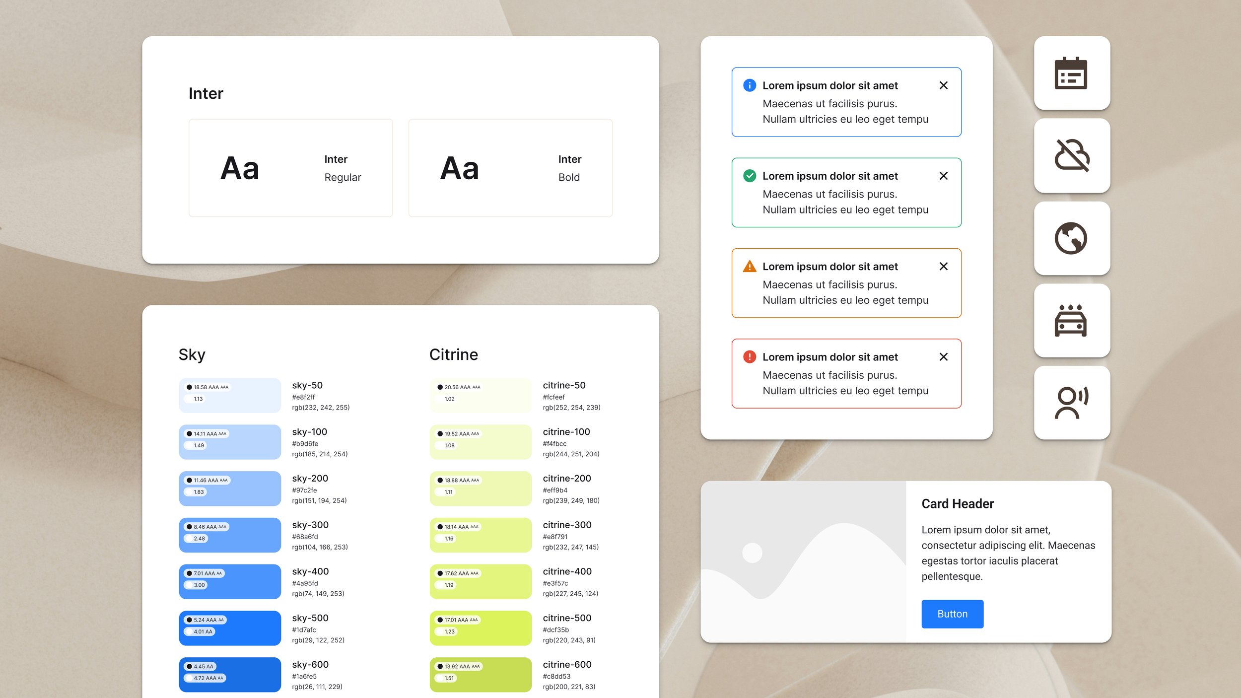
To evaluate the level of drift between systems and work toward a more consistent brand experience, I audited both design systems side by side to identify gaps, overlaps, and inconsistencies. The work involved reviewing roughly 140 components spread across more than six files, each reflecting different stages of the organization’s design system maturity.
I organized the components using the Atomic Design structure, grouping them into atoms, molecules, organisms, templates, and pages to better understand how each system was built. My process included evaluating naming, styling, structure, organization, behavior, documentation depth, and WCAG accessibility compliance to align with modern best practices. This gave me a solid view of the current state of each design system and helped me begin shaping a roadmap for bringing them together into one cohesive brand.
This analysis helped identify which components were specific to product, marketing, or shared, and how they should be documented in a single system such as Zeroheight or Storybook. It also clarified what was mature, what needed refinement, and where alignment would reduce drift across teams. With this foundation, it became clear what each team needed to improve internally before moving into shared system work
Insights
After meeting with each team, it became clear that both groups had inherited their design systems and were actively working to improve them. They understood the systems were not perfect and were making progress, but they were doing so independently and without a clear plan for unification. This explained the uneven structure, the different approaches to updates, and why documentation was spread across several files with varying levels of detail.
The audit revealed inconsistencies in foundational elements such as spacing, color, scale, and typography, which contributed to visual drift and made the brand feel less unified across platforms. It also showed inconsistent documentation structure, depth, limited accessibility guidance, token readiness, and onboarding materials that did not give growing teams a reliable standard to follow.
Overall, each team’s design system was lean with little need to consolidate or remove redundant components. Instead, the audit clarified which components, variants, and patterns belonged to product, which belonged to marketing, and which should be shared. This created a clear decision framework for future unification and set the foundation for aligning both systems in a scalable way.
Solutions
To address the inconsistencies between the two design systems, I created a roadmap that clarified what each team needed to improve within their own system while outlining how their work would come together over time. The first priority was aligning foundational elements such as color, typography, spacing, and scale. Establishing consistent foundations gave both teams a shared baseline and reduced visual drift across products and platforms.
After each team improved the maturity of their own system, the path to unifying them included consistent documentation in a shared space, aligning to a shared grid, and standardizing tokens and spacing. I documented clear examples of similar brands that follow this model to give both teams a reference as they work through the transition.
To support long-term scalability, I recommended a modular documentation structure, a shared governance model that gave both teams a clear way to contribute, and a shared Figma library to create one source of truth. These steps created a framework for consistent updates, reduced duplication, and supported sustainable growth as the systems continue to evolve.
Outcomes
This work created clarity around the current state of both design systems and provided a path forward for unifying them into one cohesive experience. Key outcomes included:
Reviewed and organized 140 components and aligned them into Atomic categories to clarify each system’s role
Highlighted foundational inconsistencies in spacing, color, typography, and scale
Identified gaps in documentation, accessibility, and onboarding materials that impact design and engineering efficiency
Established a shared foundation for aligning tokens, grids, and documentation standards
Reduced duplicate work and created a more consistent brand experience across platforms
Recommended a governance model and shared Figma library to support cross-team alignment
Provided a framework that supports long-term growth and alignment with modular documentation, contribution workflows, and Zeroheight governance
Deep Dive
Curious to see more? I’m happy to share additional context or discuss how a design system audit could support your team.